Excel Standard Deviations and Error Bars for Better Graphs
It would be nice if all data was perfect, absolute and complete. But when it isn’t, Excel gives us some useful tools to convey margins of error and standard deviations. If you work in a field that needs to reflect an accurate range of data error, then follow the steps below to add Error Bars to your charts and graphs:
Begin by creating your spreadsheet and generating the chart or graph you will be working with.
To follow using our example below, download Standard Deviation Excel Graphs Template1 and use Sheet 1. These steps will apply to Excel 2013. Images were taken using Excel 2013 on the Windows 7 OS.
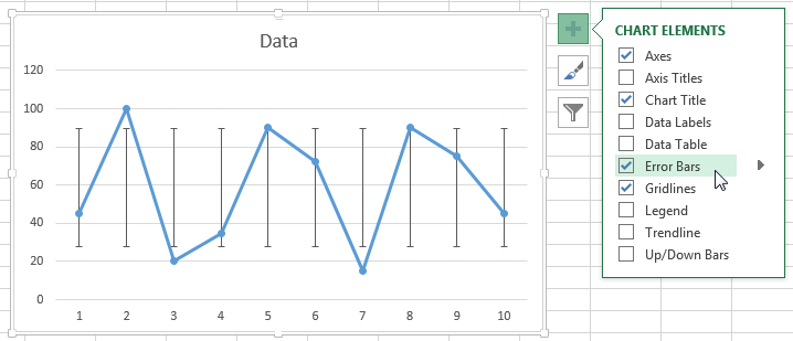
Click on the chart, then click the Chart Elements Button to open the fly-out list of checkboxes. Put a check in the Error Bars checkbox.
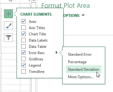
Click the arrow beside the Error Bars checkbox to choose from common error types:
- Standard Error – Displays standard error amount for all values.
- Percentage – Specify a percentage error range and Excel will calculate the error amount for each value. Default percentage is 5%.
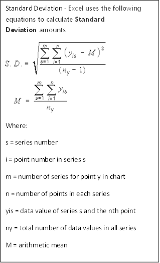
- Standard Deviation – Displays standard deviation error amount for all values. Resulting X &Y error bars will be the same size and won’t vary with each value.
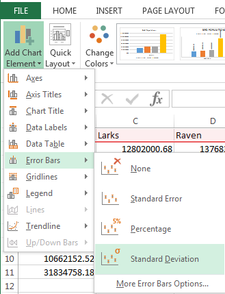
You can also turn on Error bars from the Add Chart Element dropdown button on the Design tab under the Chart Tools contextual tab.
SAVE $10 AND TRAIN ON THIS TOPIC TODAY
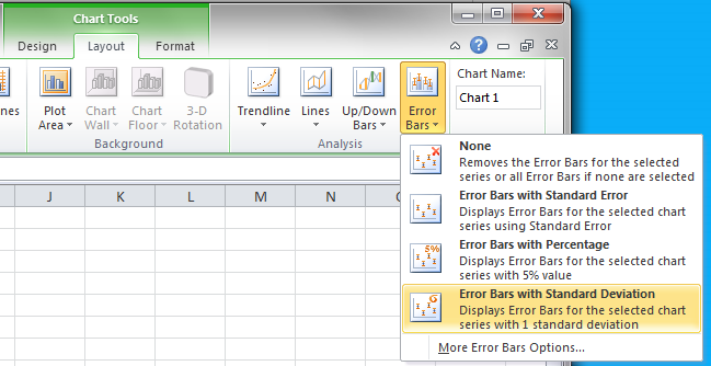
Blast from the Past: Error Bars function similarly in Excel 2007-2010, but their location in the user interface changed in 2013. To find and turn on Error Bars in Excel 2007-2010, select the chart, then click the Error Bars dropdown menu in the Layout tab under the Chart Tools contextual tab.
Customize Error Bar Settings
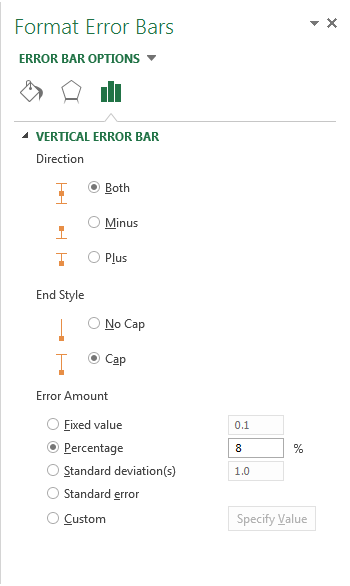
To customize your Error Bar settings, click More Options to open the Format Error Bars Task Pane.
To follow using our example, download the Standard Deviation Excel Graphs Template1 and use Sheet 2.
From here you can choose to:
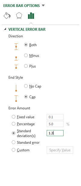
- Set your error bar to appear above the data point, below it, or both.
- Choose the style of the error bar.
- Choose and customize the type and amount of the error range. Select the type of error calculation you want, then enter your custom value for that type.
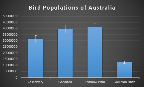
Bar chart showing error bars with custom Percentage error amount.
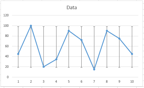
Line chart showing error bars with Standard deviation(s) of 1.3
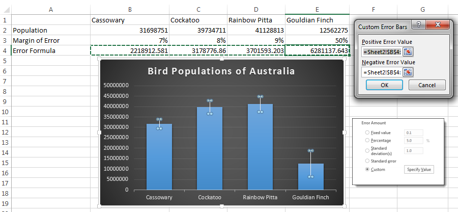
If you need to specify your own error formula, select Custom and then click the Specify Value button to open the Custom Error Bars dialog box. In the dialog box you can enter an absolute value or a formula to treat all data points equally. Or, you can enter a cell range that contains an Error result that you need for each individual data point.
In this over-simplified example, we selected B4:E4 cell range for both positive and negative error values. These cells contain a formula that calculates the error value based on a margin of error that is unique to each type of bird species. The resulting error bars, then, are also unique to each bar in the chart.
The addition of error bars can help the statistician or researcher, or anyone working with complex data, convey their information with visual impact and clarity.


