Excel Dynamic Charts: A Great Time Saving Tool
If you use Excel for reporting on results each month, you have probably needed to adjust your charts automatically to add a new month, state, or sales rep. Typically, that means clicking on each chart and adding a new data series or expanding the range of the current series.
Unfortunately, it is easy to miss an update, and nobody likes turning in the monthly reports to the boss and hearing, “Why don’t these charts include February?” Wouldn’t it be nice if the chart adjusted itself automatically?
Make a dynamic chart
Your chart will adjust itself to include new rows and column in your data if you base the chart on a table. (We have demonstrated this feature in Excel 2013, but the table has been present in all versions since Microsoft Excel 2007.)
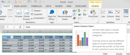
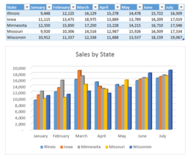
1. Enter your data in rows and columns, just as you have always done. To make your table and your chart easier to understand, add labels at the top and on the left. Here is a sample showing a company’s sales by state and by month.
2. Click on the word “State” and, holding down the mouse button, drag until you have selected the entire range.

3. On the Insert ribbon, click Table.
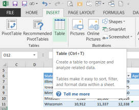
4. Your new table now has special formatting, sorting, and other capabilities. (Feel free to explore the Table Tools Design ribbon, though you won’t need those capabilities to set up your chart.)
5. With the table still selected, click on your favorite chart type on the Insert ribbon.
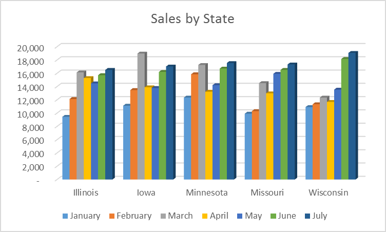
6. This is a sample column chart that shows the results grouped by state.
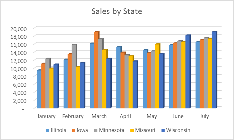
7. This is the same chart with the rows and columns switched.
So far, it’s just like the ordinary process of creating a chart, right?
Now try adding a row
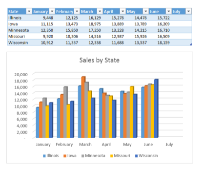
1. Your data table is enclosed by a thin border with a right angle bracket on the lower right corner.
2. Drag that bracket to the right (to add a month) or down (to add a state), and the chart adjusts automatically to include the new data.
3. Enter your new numbers, and watch the columns appear in the chart.
Other options for Excel dynamic charts
Do you want even more flexibility in your range selections? Do you ever need to graph, say, only the last three months, and do you want your chart to update itself automatically to show data from those last three?
Or are you using an older Excel version that does not include tables?
Excel boasts a more powerful means to create dynamic charts using range names and offsets. Unfortunately, the new flexibility comes with increased complexity and more opportunities for errors. We’ll discuss these dynamic range names in a future post.


