Using the Excel Pivot Table Grouping by Month to View Data Differently
PivotTables have some useful “hidden” features that can make interpreting your data even easier. One such feature allows you to view data by date groupings (such as month, quarter, even week and hour of day). By grouping within the PivotTable itself, you avoid constantly changing your source data and creating multiple PivotTables from the same data.
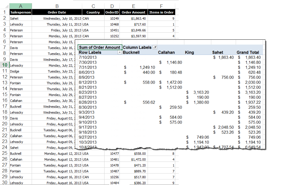
To use the Group feature within a PivotTable, create or open the PivotTable that contains data organized by date. Steps shown below apply to Excel 2007 and later. Images in this article were taken using Excel 2013 on the Windows 7 OS. To follow using our example data, download Group PivotTables by Month.xlsx
Step One: Group your PivotTable by Month
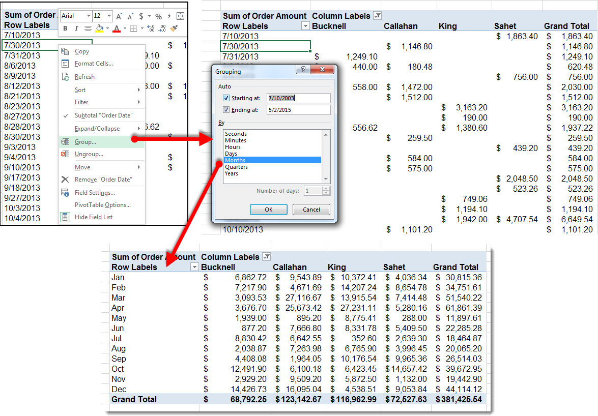
Right-Click on any cell within the Dates column and select Group from the fly-out list. Then select Month in the dialog box. Using the Starting at: and Ending at: fields, you can even specify the range of dates that you want to group if you don’t want to group the entire list.
Step Two: Group your PivotTable by Month and Year
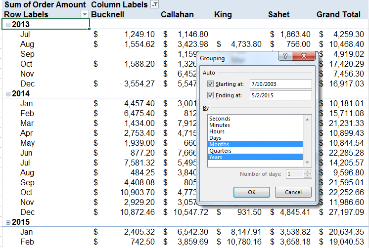
Notice that in our example, there are three years’ worth of data. Using Month as a filter combines the sales data for each month into one line, representing the sum of all three years. We might use this information to see if there are seasonal sales trends throughout the year, based on several years of data.
However, if you wish to see linear trends over all three years, simply add Years to your choice in the Groupings dialog box. When you add more than one Group by, you can then collapse and expand the groups by clicking the + or – icon beside the group:
Step Three: Group your PivotTable by Week
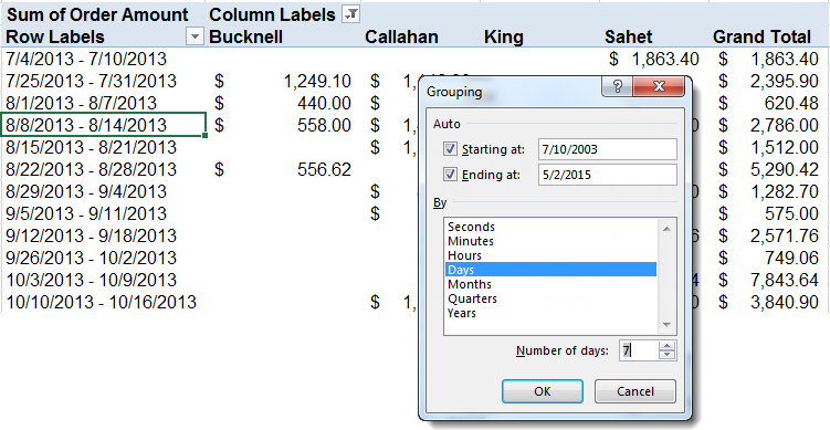
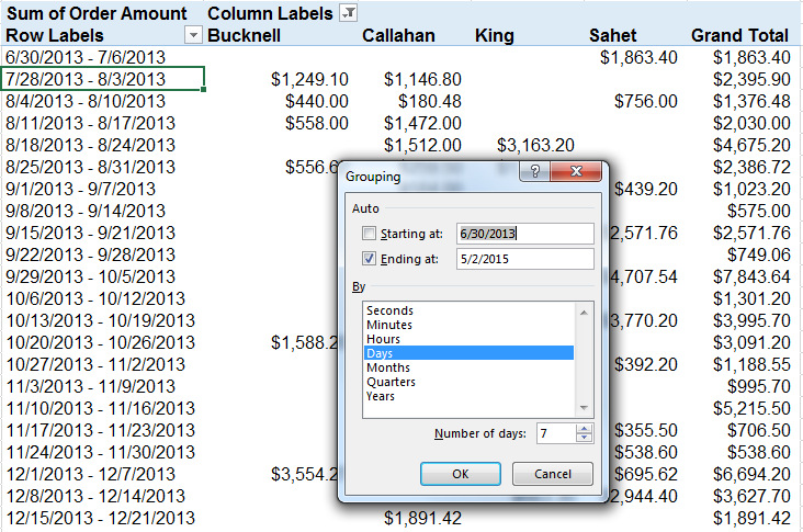
There is not a “Week” selection in the Grouping dialog box. To organize your data by week, select Days, then put 7 in the Number of days: field:
Hint! Set your week’s starting date!
In our example, you might notice that the first “week” is July 4-July 10, which in 2013 was a Thursday-Wednesday. This happens because our first recorded date is July 4. To show a traditional Sunday-Saturday work week in your groups, manually set the Starting at field to a Sunday close to your first recorded date, such as June 30:
Step Four: Show Totals by Difference
Once you have sorted your information by month, you may want to learn something different about your data, such as how your sales totals change month by month. Your PivotTable can show your monthly sales numbers in terms of the difference from the previous month.
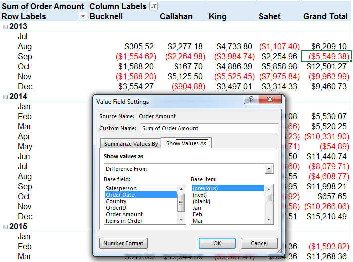
To show “Difference from” totals, click on any number in the column you want affected, in this case “Sum of Order Amount”, then click Value field settings from the Active Field group on the Analyze tab.
On the Show Values As tab in the dialog box, choose Difference From in the Show values as dropdown menu, and (previous) from the Base item selection box. Your PivotTable will now show how each Salesperson performed over time by indicating the difference in sales from the previous month.
Grouping data within a PivotTable, and especially date-based data, allows you to combine the analysis power of the PivotTable with the familiar tools that make reading the results much more useful.


