How to Create an Excel Funnel Chart
If you work in sales, marketing or any department that uses/receives reports from Business Intelligence software, you’re probably familiar with the Sales Funnel Chart. If you are looking to create a funnel chart of your own, you might find that it’s a bit of a trick. Excel gives you the tools to create the iconic upside-down pyramid, but not without some effort.
In addition, Microsoft changed the way you set the shape of a column chart in Excel 2013.
The following will show you how to create a funnel chart in both Excel 2007-2010 and 2013. To follow using our example, download Excel funnel chart.xlsx
Create a Funnel Chart in Excel 2007-2010
Images in this section were taken using Excel 2010 on Windows 7
- Highlight the data that you want to incorporate into your chart. This example uses # of accounts in the pipeline.
- On the Insert tab, select a basic 100% stacked pyramid from the Column dropdown button.
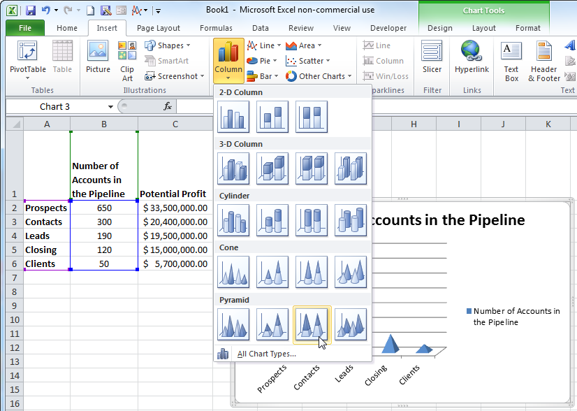
- Select the data series by clicking on any datapoint.
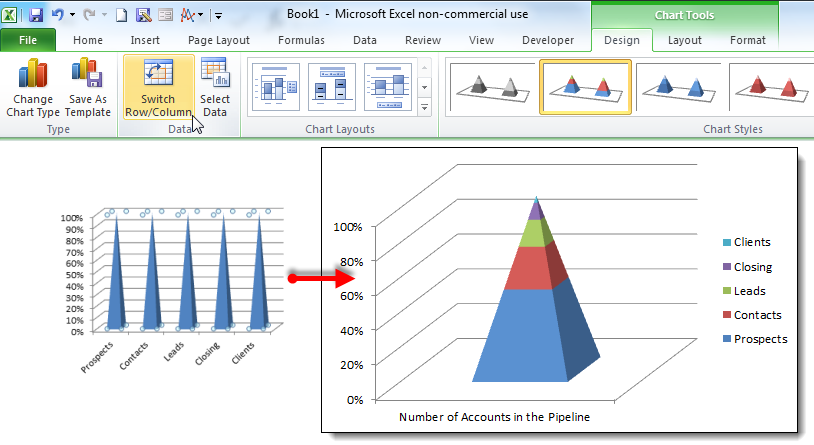
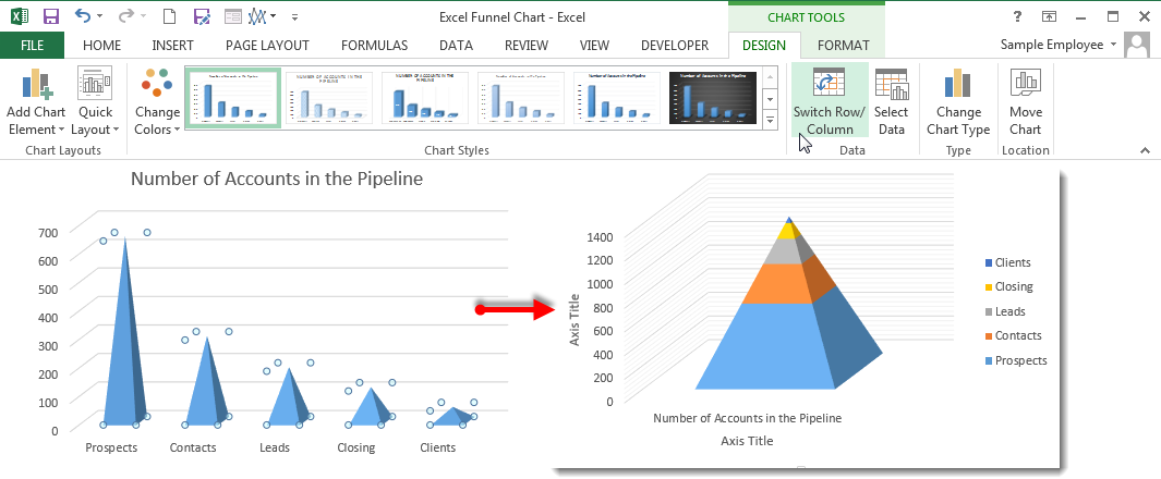
- On the Design tab, click the Switch Row/Column button in the Data group.
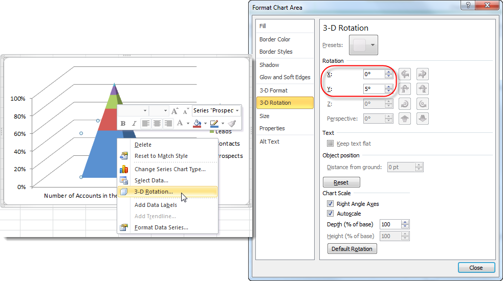
- Right-click on the pyramid and select 3-D Rotation from the fly-out menu.
- Change the X and Y Rotation to 0o.
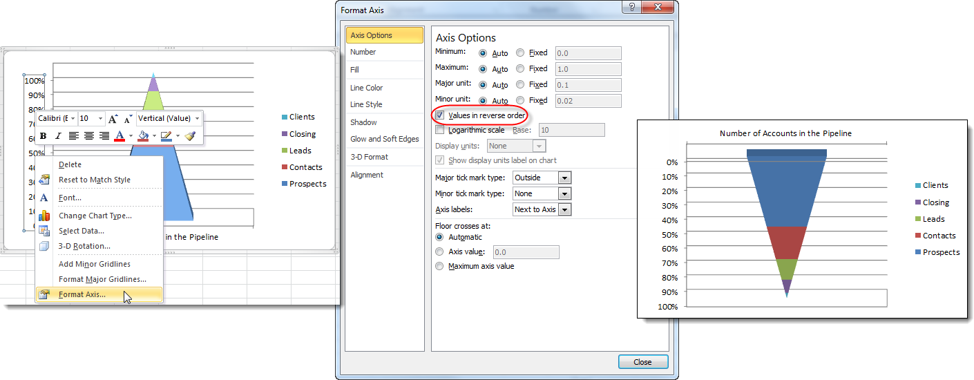
- Right-click on the Vertical Axis and select Format Axis from the fly-out menu.
- Check the Values in reverse order checkbox and you have your funnel chart.
Create a Funnel Chart in Excel 2013
Images in this section were taken using Excel 2013 on Windows 7
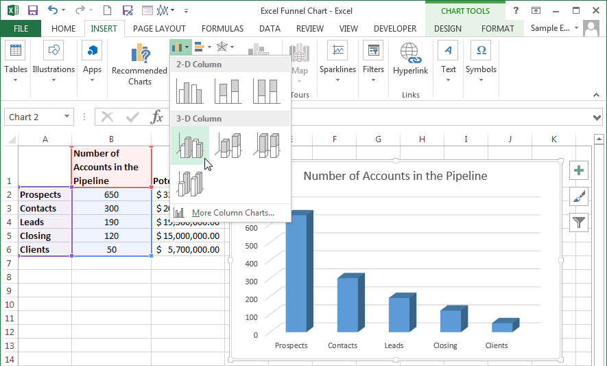
- Highlight the data that you want to incorporate into your chart.
- On the Insert tab, select a basic 3-D Stacked Column chart.
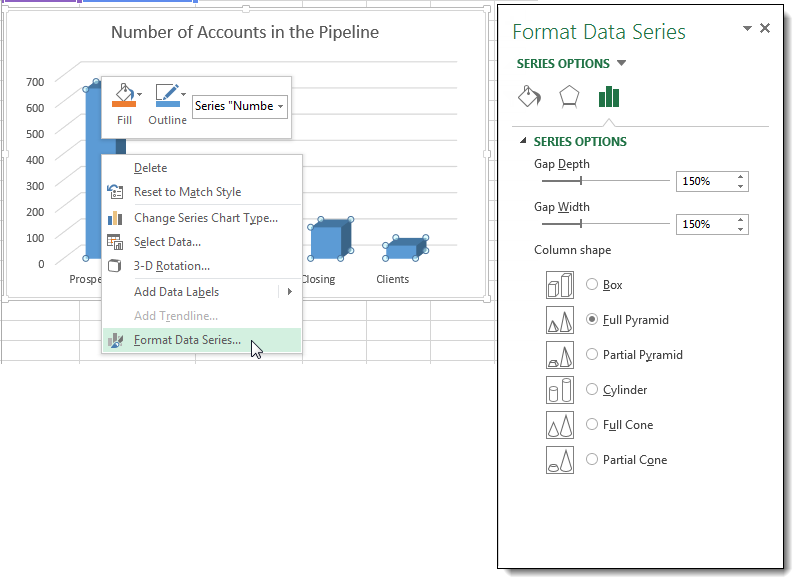
- Right-click on any series columns and select Format Data Series from the fly-out menu. This will open the Format Data Series pane.
- Select Full Pyramid from the Column shape options.
- Select the data series by clicking on any datapoint.
- On the Design tab, click the Switch Row/Column button in the Data group.
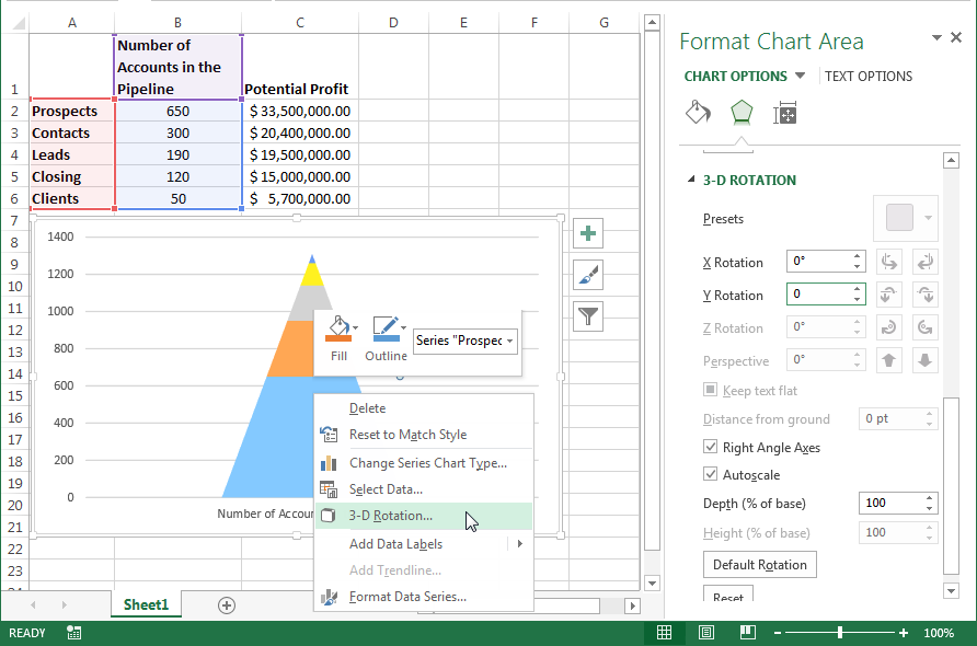
- Right-click on the pyramid and select 3-D Rotation from the fly-out menu.
- Change the X and Y Rotation to 0o in the 3-D Rotation section of the Format Chart Area pane.
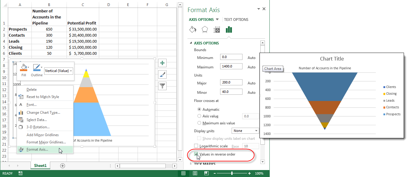
- Right-click on the Vertical Axis and select Format Axis from the fly-out menu.
- Check the Values in reverse order checkbox on the Format Axis pane and you have your funnel chart.
Once you have your excel funnel chart funneling your data in the right direction, you can clean up the chart labels and titles and adjust the design as needed.
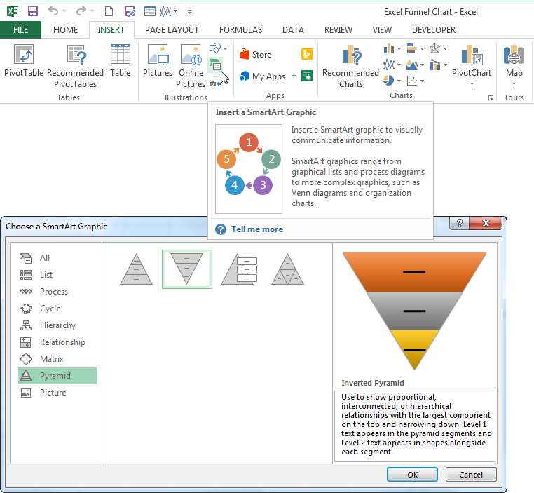
Hint! If your chart is not based on a specific set of data or is only needed to convey an idea instead of numbers, it might be simpler to use a Pyramid SmartArt graphic.


