How to Create a Secondary Axis Excel Chart (AKA Dual Axis Chart)
If you have two data series that are related, but not comparable, it might be tough to chart it. For example, let’s say you have data representing the sales of products. You also have the production costs. When you subtract the production cost from the sales data, you get the gross profit. Divide this remainder by the production cost, and you get the profit percentage. So, if you’d like to see the profit percentage, which is usually a value of 1 or less, plotted with the sales price, typically a much larger value, using a regular chart style will render the profit percentage virtually invisible. To see both and how they correlate, we’ll need to use a Secondary Axis Chart. A secondary axis chart does not add a 3rd axis or dimension to your chart (Z-axis), it is more like a second Y axis.
Download SecondaryAxisChart.xlsx to work along with the tutorial.
Steps
- Select your data.
In our case the data we want to chart is not contiguous. So, we’ll select the first two columns containing the Item and sales price, then hold down the Ctrl key to select the column containing the profit percentage.
- Insert chart.
Choose the chart type in which you’d like to see your primary data series formatted. We’ll use a column chart. As you can tell, the Profit Percentage data appears to be missing. It’s there, it’s just so small when we compare it to the Sales Data.
Note: Want more room to maneuver? Try using the F11 shortcut to create your chart. By default, this will create it on a worksheet of its own, maximizing the chart size.
- Select and format secondary axis data.
It would be hard to right click on this data, since we can’t see it. So, we’ll use an alternate method to select it. This depends upon the version of Excel you are using.
Excel 2010 and Earlier:
- On the Layout tab, click the Chart Elements field in the Current Selection group.
- In the drop down list, select the “invisible” series, in our case, Profit Percentage.
- Below the Chart Elements field, click the Format Selection button.
- Click the Secondary Axis radio button.
Excel 2013 and Later
- On the Format tab, click the Chart Elements field in the Current Selection group.
- In the drop down list, select the “invisible” series, Profit Percentage.
- Below the Chart Elements field, click the Format Selection button.
- In the Format Data Series task pane, check the Secondary Axis radio button.
- Change the chart type of the secondary axis.
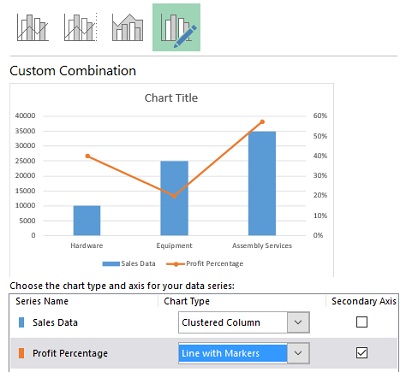
Now that you can see it, you can right click on the secondary axis series. Choose Series Change Chart Type. If you’re using Excel 2010 or earlier, choose one of the Line chart selections. In Excel 2013 and later, choose Combo. This will only change the Profit Percentage series, not the rest of the chart.
You’ll see the percentage values on the right Y axis, now.
Download the Secondary Axis Charts-Complete.xlsx file to see how you did!
For what else can I use a Secondary Axis chart?
See the post about Excel Gauge Charts to see how a secondary axis chart can help you create a speedometer like chart with a needle that moves with a changing value!


