Creating a Graph with Mutiple Data Series in Excel Without a PivotChart
One of the most powerful advantages of a chart is its ability to show comparisons between data series, but you’ll need to spend a little time thinking about what you want to show and how to organize it for excellent communication.
Let’s look at the ways that Excel can display multiple series of data to create clear, easy to understand charts without resorting to a PivotChart. These steps will apply to Excel 2007-2013. Images were taken using Excel 2013 on the Windows 7 OS.
Multiple Series Bar and Line Charts
To create an accurate chart, first make sure your data is organized with column headings and is sorted in the best way to clearly tell your story. Make sure all data uses the same scale – you don’t want one column of sales numbers to be in “dollars” and the next represented by fractions of “millions” of dollars for example.
Select the set of data you want charted. In this example, we want to compare the top 5 states by sales volume. Click the type of chart you want to enter on the Insert tab. It will look something like this:
To follow using our example, download the multiple series charts.
You can quickly see that we need to do some cleaning up before we share:
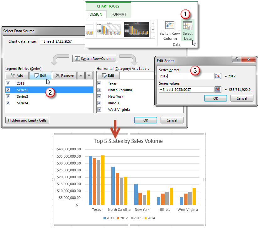
- Add titles and series labels – Click on the chart to open the Chart Tools contextual tab, then edit the Chart title by clicking on the Chart Title textbox. To edit the series labels, follow these steps:
- Click Select Data button on the Design tab to open the Select Data Source dialog box.
- Select the series you want to edit, then click Edit to open the Edit Series dialog box.
- Type the new series label in the Series name: textbox, then click OK.
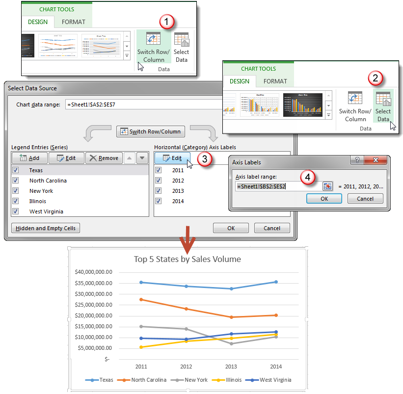
- Switch the data rows and columns – Sometimes a different style of chart requires a different layout of the information. Our default line chart makes it difficult to see how each state has performed over time. Click the Switch Row/Column button on the Design tab and then edit the series labels.
Create a Combo Chart
Sometimes you want to compare two sets of data that aren’t closely related or that would best be represented by different styles. An Excel Combo chart lets you display different series and styles on the same chart. For example, let’s say we’d like to compare the Annual Sales Total with the Top 5 State Totals to see which states are following the overall trend.
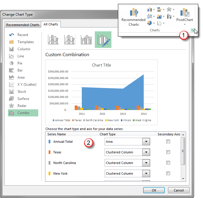
To create a combo chart, select the data you want displayed, then click the dialog launcher in the corner of the Charts group on the Insert tab to open the Insert Chart dialog box. Select combo from the All Charts tab.
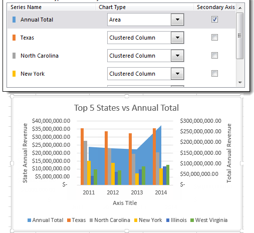
Select the chart type you want for each data series from the dropdown options. In this example, we’ve made the Annual Total an Area Chart Type and overlaid that on top of the bar types to show how much each State contributes to the whole, and how their trends match.
You can also access the Combo Chart dialog box by clicking the Change Chart Type button on the Design tab.
Bonus Hint: If, as in this example, one series of data is on a scale that renders the rest of the data difficult to read, click Secondary Axis beside the series that is out of scale.


