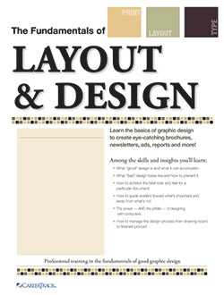
Gain the graphic design skills that will make all of your printed messages get the attention — and the results — you want!
Good design doesn't just happen... you need graphic design training seminars!
It takes special skills to assemble the headlines, text and graphics of a printed page so they catch a reader's eye and elicit the response you want.
Once you learn these basic design skills, you can apply them any time you need to communicate ideas on paper swiftly, clearly and effectively. This program helps "desktop publishers" of every level understand and practice the fundamentals of effective graphic design.
Are you in charge of "making it look good"? This training gives you the essential design principles you need.
You'll learn the skills that can move your layout and design talents into a whole different league. Once you learn and use your new skills, you'll see your publications take on a fresh and exciting look that people will notice and want to read. Newsletters, ads, press releases, even number-heavy reports and proposals — all of them will benefit from the know-how you gain from this skill-packed course.
It's that fast and effective because …
- The course content is built around topics with the greatest payback for graphic design novices. It doesn't waste your time on ideas and techniques you'll seldom use or need.
- There's not a computer in sight (they just slow things down and detract from the learning), and what you learn applies to virtually any desktop publishing system.
- You don't have to take volumes of notes (each participant receives a course manual that captures the key points).
- You get involved — examples, overheads, audience participation and hands-on exercises drive home important principles.
You'll put the skills and insights you learn to work immediately, on your own computer, with your own documents… and at your own pace. But most important, you'll like this workshop because you'll see your work get better and better with every document you design.
Create layouts that demand to be read …
This all-new CareerTrack course does more than show you how to arrange elements on a page for maximum impact and readability. It takes you beyond the "here's-how-you-do-it" stage… and explains why you're doing it. As a result, you'll not only get under the skin of good design, but also venture into the minds of your readers…
- You'll see how to add interest and drama to the dullest of topics.
- You'll learn to guide your readers where you want them to go.
- You'll discover how to hit the visual hot buttons that give you the reader reaction you're hoping for.
Plus, you'll learn the nitty-gritty that other courses tend to ignore like how to talk the lingo of printers, paper suppliers and prepress technicians.

Gain the graphic design skills that will make all of your printed messages get the attention — and the results — you want!
This program introduces you to the core skills of good desktop design. You’ll learn to assemble headlines, text, and graphics on printed pages, so that they catch the reader’s eye and elicit the response you want. You'll put the insights and tips you've learned to work immediately — on your own computer, with your own documents, and at your own pace.
Download BrochureKnow Your Reader
- How the human eye travels over a printed page — where you should position your most important and least important points
- "Do I read or do I toss?" What goes through your reader's mind in those first few seconds and how to influence the outcome
- The role of "image" and "mood" in communicating your ideas graphically
Know Your Message
- Ways to graphically spotlight ideas, benefits or product features to make a powerful — and favorable-first impression
- How to prevent "overdesigning"
- What makes a piece look "amateurish", how to spot and fix mistakes that might be creeping into your designs
Know Your Mission
- How to use graphics to get quick action: tips to make readers pull out their checkbooks or reach for their phones
- Long vs. short order forms — when to use a dense "contract" look and when it's better to be light and airy
- How different colors affect readability
- Simple graphic devices that speak louder than words (helpful to know when space is tight)
The Best Use of Art and Captions
- Choosing photos that fit your design
- Silhouetting: how it can add drama and impact to ordinary photos
- Captions can capture attention faster than most anything — tips on using them correctly
- Framing photos: understanding the different effects of borders and backgrounds
Using Heads and Subheads
- What typefaces, sizes and styles are best suited for banner headlines
- Where to put subheads for maximum impact
- All caps? Small caps? Caps and lower case? Some good rules to follow
How to Make Your Type "Talk"
- Basic typographic rules to follow (type size, column widths, spacing, kerning and tracking, etc.)
- Use of drop caps, indents and reverse type
- Some basics on mixing fonts
Putting it All Together
- What balance is, and how to achieve it from page to page, spread to spread
- The role of the grid in planning your layout
- How to use white space as a graphic device
- The most effective use of clip art, tables, charts, graphs and logos, bullets and dingbats
- How to separate elements with borders, rules, screens — without getting that "boxy" look Using sidebars and call-outs to emphasize key points
Is this seminar for you? Yes, if you fit any part of this profile…
- You've been charged with creating newsletters, ads, reports, press releases and the like — but lack formal training.
- Document design has always been a part of your job — but every piece you produce ends up looking the same as the others.
- You want your printed materials to reflect a more upbeat, professional image for your organization.
- Your people look to you for graphic guidance — but you're sometimes as unsure as they are.
- As a desktop publisher, you're good at using your hardware and software — now you only need help with design.
In one fast-paced class, you'll learn to captivate attention and convey any message with speed, impact and clarity. Don't miss this opportunity to take your design skills to the next level — and give all your printed pieces a more polished, professional look.


